|
McNugget
¯\_(ツ)_/¯
☆☆☆☆☆

|
|

04-26-2010, 09:28 AM
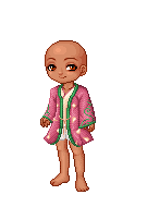
Good: It is diferent from most other avatars.
Bad: I'm not liking the yellow scarf.
|
|
|
|
|
bloodstainedwings
"avagasm"
☆☆☆☆☆
Moderator
|
|
04-26-2010, 12:53 PM
good: much more dynamic then your last outfit
bad: very bottom heavy, try adding the gold or red flight jacket for some balance.
|
|
|
|
|
MurasakiCrown
\(@O@)ʌ...
|
|
04-26-2010, 02:59 PM
You guys :heart: lol
+Lovely outfit and combination of colors.
-The gloves get a bit distracting (the ivory ones).
|
|
|
|
|
Rylynne
your resident bonafide coffee ad...
|
|
04-26-2010, 03:32 PM
The Good : The way the colors are spread is very nice and even~ :'D <3<3
The Harsh : Still find the silver crown veil odd. xDD;; <3<3
|
|
|
|
|
McNugget
¯\_(ツ)_/¯
☆☆☆☆☆
|
|
04-26-2010, 09:00 PM
Good: It's simple, and not simple at the same time. Which I like. XD
Bad: I don't really like the heart tattoo on t5he face...
|
|
|
|
|
cardigan sweaters
ʘ‿ʘ
|
|
04-26-2010, 10:12 PM
Good: Reminds me of Ace Strife, a very good avatar maker, in the sense of color and layers :)
Bad: It's plain at the moment, but I know it's a WIP
|
|
|
|
|
bloodstainedwings
"avagasm"
☆☆☆☆☆
Moderator
|
|
04-26-2010, 10:16 PM
good: unique colours and item usage.
bad: its slightly unbalanced and i didnt notice it until now. but there is light and dark blue on the head and they are not both equally represented throughout the rest of the avatar.
|
|
|
|
|
MurasakiCrown
\(@O@)ʌ...
|
|
04-26-2010, 10:55 PM
Quote:
Originally Posted by Rylynne

The Good : The way the colors are spread is very nice and even~ :'D <3<3
The Harsh : Still find the silver crown veil odd. xDD;; <3<3
|
I have to cover the gold in that head item. It bothers me...Well, the gold and teal/green color.
BSW: +lovely outfit. Reminds me of a succubus now that I think about it
-The gloves still bug me. They're distracting and interrupt the flow.
EDIT: looks like I ninja'd someone XD
|
|
|
|
|
Readera
*^_^*
|
|
04-26-2010, 10:56 PM
For bloodstainedwings
Good: I like the purple and black and gold.
Harsh: The cat tail and horns look odd. The horns look like very odd cat ears.
|
|
|
|
|
McNugget
¯\_(ツ)_/¯
☆☆☆☆☆
|
|
04-26-2010, 11:15 PM
Good: I like the librarian look.
Bad: It's too simple. You should add more to it if you think you can.
|
|
|
|
|
MurasakiCrown
\(@O@)ʌ...
|
|
04-26-2010, 11:19 PM
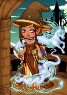
I got skipped :/
+I like that the theme looks cohesive.
-It could use a bit more silver.
|
|
|
|
|
Son Zack
(っ◕‿◕)&...
|
|
04-27-2010, 03:36 PM
For the unfortunately skipped Platinum Child~
Good: Amazing layering and use of purple, as usual. I have no idea how you fit all those items on xD Great distribution of color!
Bad: The items seem too chunky and thus it doesn't seem to flow well. I know you explained it, but yeah, the silver head thing does look a bit out of place.
|
|
|
|
|
Rylynne
your resident bonafide coffee ad...
|
|
04-27-2010, 03:39 PM
The Good : It's an interesting combination of items, I think~ =O <3<3
The Harsh : Not sure if I like how the big black scarf sort of off-balances the bare bottoms. ^^;; It's too overpowering overall, I think? XP
|
|
|
|
|
McNugget
¯\_(ツ)_/¯
☆☆☆☆☆
|
|
04-27-2010, 03:57 PM
Good: It is nicely put together.
Bad: I think you can do more with this.
|
|
|
|
|
Rylynne
your resident bonafide coffee ad...
|
|
04-27-2010, 03:58 PM
The Good : I like how the red pops out in the avatar~ :'D <3<3
The Harsh : Not sure I like the neckerchief? Seems to not fit the theme. ^^;;
|
|
|
|
|
Louis duLac
Purveyor of Yaoi
|
|
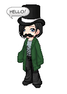
04-27-2010, 10:16 PM
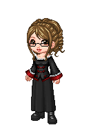
Good: Dressy uniform.
Harsh: Nothing much, actually.
|
|
|
|
|
Son Zack
(っ◕‿◕)&...
|
|
04-28-2010, 01:41 AM
Good: I like the use of the top hat! Looks like you've got a good thing going here.
Bad: The eyes don't match and it doesn't really seem finished yet. Also, the mouth kinda bugs me.
|
|
|
|
|
McNugget
¯\_(ツ)_/¯
☆☆☆☆☆
|
|
04-28-2010, 05:23 AM
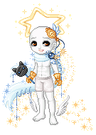
Good: I like how you put this one together.
Bad: The silver thing on your head isn't balancing to well with your silver hood. Perhaps you could replace it with something gold coloured instead? And maybe get rid of the red hearts on your legs and replace them with something gold aswell?
|
|
|
|
|
Rylynne
your resident bonafide coffee ad...
|
|
04-28-2010, 03:33 PM
THe Good : Still like how the reds and golds pop out nicely~ :'D <3<3
The Harsh : Not liking that bandana at all. >.<;; Seems out of place with its pattern. ^^;;
|
|
|
|
|
Eastriel
(。☉౪ ⊙&...
☆☆
|
|
04-28-2010, 04:39 PM
Good: Cute!
Harsh: white to the head maybe?
|
|
|
|
|
Rylynne
your resident bonafide coffee ad...
|
|
04-28-2010, 04:42 PM
The Good : Cute colors~! :'D <3<3
The Harsh : I have a love-hate relationship with your Golden Faun Horns, now that I notice them really. xDD;;
|
|
|
|
|
MurasakiCrown
\(@O@)ʌ...
|
|
04-28-2010, 05:34 PM
+Very adorable. You are like a wingless fairly X'D <3
-The upper body is almost too bright.
|
|
|
|
|
Mizayo
The Embodiment of Geekiness
☆☆
|
|
04-28-2010, 06:23 PM
Good: Very creative and original
Bad: Almost too many colors
|
|
|
|
|
McNugget
¯\_(ツ)_/¯
☆☆☆☆☆
|
|
04-28-2010, 07:25 PM
Good: Even though it's alot of blue, I think it does well being mostly only one colour. :)
Bad: Not my favourite shade of blue.lol j/k It looks a bit empty. Perhaps you need something on your head?
|
|
|
|
|
Mizayo
The Embodiment of Geekiness
☆☆
|
|
04-28-2010, 07:29 PM
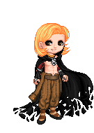
Good: I really like the colors; like the red and orange.
Bad: I'm not really feeling the open ribs. It kind of takes away the feeling of mystery to the avatar. But... that's just me.
|
|
|
|
| Currently Active Users Viewing This Thread: 1 (0 members and 1 guests) |
|
|
|