|
Kilia
(^(エ)^)
☆☆

|
|

06-13-2012, 06:51 PM
Helpful Sites and Advice
Pixel Art Tutorial
Derek Yu
Quote:
Originally Posted by Maria-Minamino

the best thing you can do - use the darkest color for the outline ONLY. The second darkest color I usually use for ONLY the outline as well but will use very sparingly on the item if I have too. I reserve the middle 3 colors for coloring the item and the lightest color for some highlights which I also use sparingly.
|
Quote:
Originally Posted by Demoscout
You've got the right idea, but the outline for the lighter and highlighted areas should not be lighter than the areas themselves. Just a shade or two darker.

This is a pretty poorly put together visual of the point I'm trying to make.
---------- Post added 06-15-2012 at 11:45 AM ----------
Also I zoomed in and drew around this area.

After fixing the outlines, you should take out those dark bits. It makes the outer edges look kinda static-y. |
Quote:
Originally Posted by Maria-Minamino
Okay
First thing - the lines should never overlap. I circled a part of the shirt near the boobs that make it look like a ladder climbing up...then I took that part and copied it and took away those extra lines so that it was truly just an outline not a climbing motion - do you see the difference? (I hope I'm making sense).
Second thing - the neckline could use some work - I yellow lined it (since redlining would have blended into the shirt)...you can bring the part by the neck UP a little bit. Then you should get rid of the extra pixels like I was talking about in point one...
Make sense?
We are fixing shape before we fix shading.
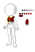 |
Quote:
Originally Posted by Maria-Minamino
Kilia: - I still see double pixels around the neck. I circled it all in grey....
For now, I would use just the darkest shade of red, shade 6, for the outline and shade the outline later

Here is an example:

doubling it makes it look too thick
|
Last edited by Kilia; 02-27-2013 at 02:51 PM..
|
|
|
|