Quote:
Originally Posted by Rainbows

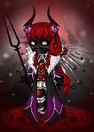
The 'inlines' (the outlines within the clothing) are way too dark! oxo
I like the shape, except for our lefthand side, the edge on the torso - it looks like it's pinned in place (unnatural).
|
OMG I didn't see this I'm sorry D:
I agree about the torso - I'll expand it one pixel and see how it looks that way.
I was using the second darkest shade for the inlines - should I go to the third darkest shade?
---------- Post added 06-17-2012 at 11:00 PM ----------
Quote:
Originally Posted by Cora Lorington
I'm the same way, I love pointers....but I've been afraid to give pointers to the rest of the people....afraid they would get offended....because some people do.
|
SOmetimes it's a blow to my ego when I make something I love and people are like "This is wrong, this is wrong, change this, that's ugly, that's wrong, aaaand this" btu I know it's to help me improve so I never say anything but thank you and go to change the item (or totally ditch it if it's that bad) :D XD
Quote:
Originally Posted by Rainbows
I posted a little crit on the last page ;u;
|
Sorry I missed it - I just posted a reply!