|
kimu
\ (◡) /

|
|

06-13-2007, 09:11 AM
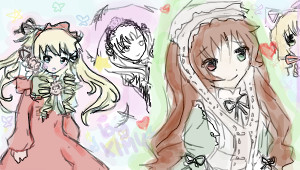
Here are some of my recent drawings. Please tell me if my coloring is good : 3

Heres a cover I did for a webcomic I REALLY hope to do soon. Or a comic. Or a whatever.
CLICK MEH
Some gaia avvie art I did for a friend, I felt like I owed him this, FOR A LONG TIME NOW, for him being so awsome as to talk to me about his awsomeness and stuff.
Its a PSP wallpaper, for my future PSP : 9
The girl to be god
I know, girly, but bear with me and let me know if any of the coloring is any good? xD
|
|
|
|
|
mystic kiwi
(っ◕‿◕)&...
|
|
06-13-2007, 10:19 AM
I like the light colours a lot and the sketchyness. I hope you do the wedcomic, your characters look cute! ^^
|
|
|
|
|
Hannahballistic
(-.-)zzZ
|
|
06-13-2007, 08:53 PM
Hm..I do like the sketchiness of your style. It's very unique. n_n
|
|
|
|
|
kimu
\ (◡) /
|
|
06-13-2007, 09:00 PM
Quote:
|
Originally Posted by mystic kiwi
I like the light colours a lot and the sketchyness. I hope you do the wedcomic, your characters look cute! ^^
|
Thanks! [ cute...T___T ]
|
|
|
|
|
kimu
\ (◡) /
|
|
06-13-2007, 09:00 PM
Quote:
|
Originally Posted by Hannahballistic
Hm..I do like the sketchiness of your style. It's very unique. n_n
|
I gueeesss its unique ^^'
|
|
|
|
|
Caeluma
(っ◕‿◕)&...
|
|
06-14-2007, 02:41 AM
cute ^_^
|
|
|
|
|
kimu
\ (◡) /
|
|
06-14-2007, 03:50 AM
Quote:
|
Originally Posted by Caeluma
cute ^_^
|
Thanks = __=
|
|
|
|
|
Sandra
ʘ‿ʘ
|
|
06-14-2007, 04:03 AM
I agree with the others, the light colors combined with the sketchyness makes them so cute.~
|
|
|
|
|
kiarakiara
ʘ‿ʘ
Banned
|
|
06-14-2007, 11:56 AM
I like it. It kinda reminds me of Sierse of unfortunite events. thats just me. Keep up the good work and keep drawing.
|
|
|
|
|
Caeluma
(っ◕‿◕)&...
|
|
06-14-2007, 01:45 PM
your welcome
|
|
|
|
|
kimu
\ (◡) /
|
|
06-14-2007, 10:23 PM
Quote:
|
Originally Posted by kiarakiara
I like it. It kinda reminds me of Sierse of unfortunite events. thats just me. Keep up the good work and keep drawing.
|
How so? o.o
Okkies ^^
|
|
|
|
|
BE
n/a
|
|
06-15-2007, 02:27 AM
Cute, but sloppy. Unless that's what you're going for.
|
|
|
|
|
Dans Le Passe
(-.-)zzZ
|
|
06-15-2007, 05:22 AM
Preeettttyyyy :]
|
|
|
|
|
kimu
\ (◡) /
|
|
06-16-2007, 12:59 PM
Quote:
|
Originally Posted by BE
Cute, but sloppy. Unless that's what you're going for.
|
I cant exactly not be sloppy [without a tablet]. I mean come on, I use a mouse for pete's sake D :
|
|
|
|
|
Otohime
(っ◕‿◕)&...
|
|
06-16-2007, 01:41 PM
Quote:
|
Originally Posted by kimu
Quote:
|
Originally Posted by BE
Cute, but sloppy. Unless that's what you're going for.
|
I cant exactly not be sloppy [without a tablet]. I mean come on, I use a mouse for pete's sake D : |
I've seen plenty of people with better mouse work than tablet worshippers. :/
|
|
|
|
|
Lehila
Dead Account Holder
|
|
06-16-2007, 06:39 PM
Quote:
|
Originally Posted by mystic kiwi
I like the light colours a lot and the sketchyness.
|
yup yup, it looks nice :)
|
|
|
|
|
kimu
\ (◡) /
|
|
06-17-2007, 07:18 AM
Quote:
|
Originally Posted by Otohime
Quote:
|
Originally Posted by kimu
Quote:
|
Originally Posted by BE
Cute, but sloppy. Unless that's what you're going for.
|
I cant exactly not be sloppy [without a tablet]. I mean come on, I use a mouse for pete's sake D : |
I've seen plenty of people with better mouse work than tablet worshippers. :/ |
Well people work differently with different stuff, differently xP
Ex, one can be good at useing a mouse, when another person can be better at using a tablet. It also depends how sucky your mouse is.
|
|
|
|
|
0_cherry_0
Dead Account Holder
|
|
07-31-2007, 11:57 PM
Awesome!
|
|
|
|
|
Swansong
The mene ditcher
|
|
08-01-2007, 01:53 AM
I really like the PSP wallpaper~! It looks very detailed and it has a unique flare! Thats very good for a mouse pic, I stink at using the mouse. I like the soft colors aswell. It is sketchy but I enjoy sketchy styles!
Great work~!
|
|
|
|
|
mangacatgirl
\ (◡) /
|
|
08-06-2007, 01:34 AM
Quote:
|
Originally Posted by kimu
I cant exactly not be sloppy [without a tablet]. I mean come on, I use a mouse for pete's sake D :
|
I use a mouse too... I assure you... it doesn't have to be sloppy.
I'm not sure what they have to do with Rozen Maiden... the art is cute... The colouring I must say could use more work... It's pretty basic and well... for lack of another word "sloppy" (Though not to a great extent or anything). I think if you take your time and put a little more effort into the colouring, it would look much better. Like not letting the little flakes of white background trickle through the coloured sections, and not going outside the lines or possibly adding more shadow and high light colours might be nice...
But then maybe I'm completely missing the point of your art... Perhaps it's supposed to... or meant to look a bit childish... If that's the case then I suppose it's just fine ^.^ None the less the drawings themselves are cute.
|
|
|
|
|
Meirles
⊙ω⊙
|
|
08-06-2007, 07:49 PM
Hm, the only thing I could say for the webcomic cover is purely aesthetic. Maybe put the blue panel in bewteen the two red panels to create more contrast. :D Unless you need the characters in that order.
|
|
|
|
| Currently Active Users Viewing This Thread: 1 (0 members and 1 guests) |
|
|
|