|
DragonRose215
(-.-)zzZ

|
|

03-19-2010, 09:04 PM
|
|
|
|
|
Aninaj
(-.-)zzZ
|
|
03-20-2010, 12:16 AM
She is very pretty =)
|
|
|
|
|
MoodyBats
Scarce Menewshan
☆☆
|
|
03-20-2010, 05:23 AM
very nice job better than what i could do xD
|
|
|
|
|
DragonRose215
(-.-)zzZ
|
|
03-20-2010, 07:42 AM
^_^ Thanks everyone!
|
|
|
|
|
Deadly_Lotus
|
|
03-20-2010, 02:51 PM
Such a wonderful piece of work you have produced. I am amazed by the talent in which you have, the tones - - and shading is truly amazing.
|
|
|
|
|
DragonRose215
(-.-)zzZ
|
|
03-20-2010, 07:24 PM
^_^ Thank you very much
|
|
|
|
|
Nat_The_Cat
(-.-)zzZ
|
|
06-17-2010, 10:06 PM
You seriously drew that?
It's AMAZING.
and I just love Chii
|
|
|
|
|
Tuomas Aho
(-.-)zzZ
|
|
06-22-2010, 02:29 AM
the line art is very good, but the way you blur the colors spoils it...
|
|
|
|
|
IngridInnsbruck
(-.-)zzZ
|
|
06-22-2010, 01:19 PM
Pretty. Which program did you use to make it?
|
|
|
|
|
yuki_snow
⊙ω⊙
|
|
06-22-2010, 02:53 PM
Quote:
Originally Posted by Tuomas Aho

the line art is very good, but the way you blur the colors spoils it...
|
but still look nice :rofl: and cute =3
|
|
|
|
|
Skater Chick
|
|
06-26-2010, 05:30 PM
So cute ;o I'm amazed
|
|
|
|
|
Fortis Silas
Dead Account Holder
|
|
06-26-2010, 05:36 PM
I agree that the way you colored it just seems wrong, and it stands out starkly against the fishnets.
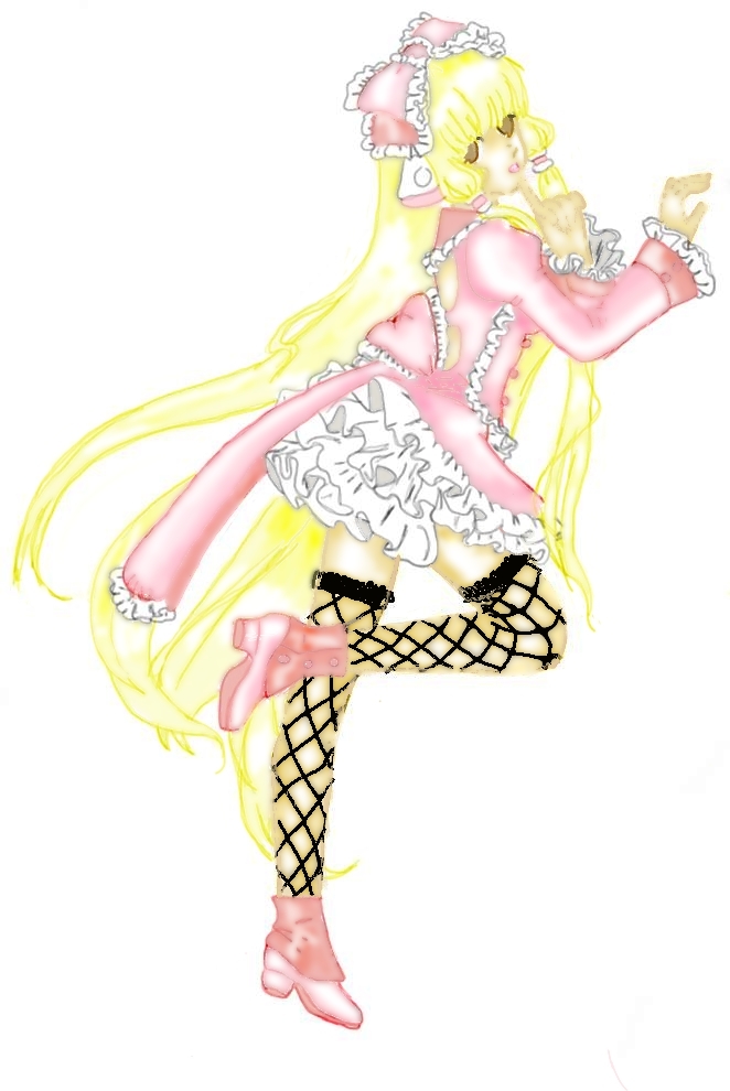
About those fishnets: There are a few spots where the fishnets don't go far enough, some spots where it goes too far and goes off the leg and some where it obviously fades due to the blur tool, which is confusing since they stick out so much they seem out of place everywhere else. Not to mention the lines on them seem rough.
Other than that it's beautiful, and much better than anything I could do. The detail on the lace is excellent. (Although its lines, too, stand out a little awkwardly against the rest of the blurred colors and lines. Not as much as the fishnets, though.)
In other words: Good job!
|
|
|
|
|
Saira Bellus
You'll find me where the flowers...
|
|
06-29-2010, 05:08 AM
Quote:
Originally Posted by Tuomas Aho
the line art is very good, but the way you blur the colors spoils it...
|
I agree.
Also sharper lines on the face would make it look 100x better.
Pretty though. C:
|
|
|
|
|
Moostar
(-.-)zzZ
|
|
06-29-2010, 07:18 AM
oh wowie!! she is so pretty! and the colors and lines are so soft and cute !! lol I love it! good job
|
|
|
|
|
Mystic Guardian
|
|
07-08-2010, 03:58 AM
Fantastic job! hate to repeat but lines and blur as well. The pink (and the yellow in particular) seems 50x brighter than anything else. Tone down the brightness nd blur and you have and even more fantastic piece of work!
|
|
|
|
| Currently Active Users Viewing This Thread: 1 (0 members and 1 guests) |
|
|
|