|
June
(っ◕‿◕)&...

|
|

05-31-2007, 12:56 AM
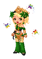
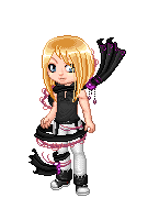
Its my first time doing an all-out illustration outline, color, shading, I even slapped a background on it so let me know if there's anything at all that I could work on for my next illustration. And I mean anything. Anatomy, lineart, color schemes, ANYTHING.
If you'd like to see the work in progress and how much she changed over the whole process, you can see that here: [link]
Now, without further ado, here she is:
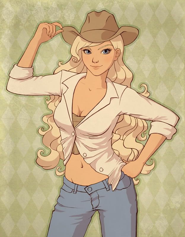
She's also on deviantART if you'd like to see a slightly bigger version: [link]
|
|
|
|
|
Caeluma
(っ◕‿◕)&...
|
|
05-31-2007, 01:26 AM
thats awsome! I love it! your colouring is wonderfull
|
|
|
|
|
June
(っ◕‿◕)&...
|
|
05-31-2007, 02:24 AM
Thanks! ^_^
|
|
|
|
|
Winnsome
(◎_◎;)
|
|
05-31-2007, 02:46 AM
Oh wow, she's gorgeous! I love this. @__@ *dies* <3
|
|
|
|
|
June
(っ◕‿◕)&...
|
|
05-31-2007, 02:50 AM
Thanks so much! ^_^
|
|
|
|
|
Winnsome
(◎_◎;)
|
|
05-31-2007, 02:53 AM
Out of curiosity, on the WIP, how did you get from the thick to the thin lineart? XD <3
|
|
|
|
|
noirette
⊙ω⊙
|
|
05-31-2007, 03:00 AM
Wow, that looks really professional <3 There are so many gorgeous things about this: the clean lines, her eyes, her face just in general, her haughtiness -- it all gives a great first impression for the picture & gives a great lasting impression.
You said you wanted concrit though, & I'll oblige. Both hands look the slightest bit off - on the hand that's balled up into a fist, I believe you would be able to see a small bit of the individual fingers. Did you model the fingers pulling at the hat with your own fingers? It make just be my hand (which is rather small), but my fingers curl inwards more, giving the hand more tension & I think if you changed that in the picture it would look more realistic.
The folds on the shirt & pant are wonderful; they give a good sense of detail that doesn't overwhelm the eye. However, upon inspection, I don't believe that the button flap would droop down if the pants are as tight as they appear by the wrinkles around her thighs. The wrinkles also look inconsistent: wouldn't there be more pulling around her left leg? The shirt, too, looks a little off. I don't think the bottom right side of her shirt shouldn't be completely behind her.
Other random nitpicky things: her hair could be more detailed, I love to see whispy lines indicating hair instead of just those bold shadows. I love the background texture, but I don't like the pattern. I think a solid would fit the picture better. You also could have colored the buttons to add a little more to her outfit. Jean buttons are rarely blue; the shirt buttons could very well be tan, but they could also be something else.
I have to say this is a really lovely picture - whatever imperfections I may have been able to find, at first glance it does pop and most of the picture lives up to that first impression. For your next picture, I would model yourself in whatever pose you're drawing -- if you did that & this is the pose you got, then you know I'm simply being anal. Your knowledge of the way clothes fold over the body is good but could be better, as could everyone's. Overall, this is a beautiful picture in part because of its simplicity & I applaud you & your desire to do better. <3
|
|
|
|
|
Kasimir De
*^_^*
|
|
05-31-2007, 05:17 AM
Nice~ x3333333 though I agree with Noirette that some folds on the shirt are unnatural and give the shirt kinda a feeling of.....paper? I mean, some folds look too sharp and it gives a feeling that the textile is more stiff than the usual cloth texture.
Other than that, the elbows are bugging me a bit because I think they're too sharp. You could even use an elbow like that to stab people to death instead of using a knife :lol: And the last thing, in my opinion, the hand that she puts on her hip is tad small. Those are all that I think could be improved, the rest are already thumb up. :wink:
|
|
|
|
|
June
(っ◕‿◕)&...
|
|
06-01-2007, 05:14 AM
@ Winnsome:
Glad you asked! This little issue very nearly caused me to abandon the entire drawing out of frustration. I had finished the outline and had decided, after spending what seemed like eons on it, that the lines were too thick and that they needed to be thinner. I didn't want to go through all the trouble of erasing around everything to thin them so I asked around about some kind of shortcut. Unfortunately nobody could help me. T_T I was frustrated and gave up on the drawing for a while until I randomly ran across a cell shading tutorial that just happened to have the answer to my problem in it! Here's how you do it:
1. Select just your outlines.
2. Go to Select > Inverse
3. Go to Select > Modify > Expand
4. Depending on how thick your lines are, do it by 1 or 2 pixels, and TAH-DAH! You have thinner lines! :D
@ noirette:
Wow, I couldn't have hoped for a better critique. I agree on the hands. I did pose myself and even took pictures to look at on screen, but they still turned out the slightest bit wonky. Thanks for pointing out the smallness of the fist on her hip; I hadn't noticed that before. ^^
As for the pants/wrinkles thing, you're probably right. I had a reference picture for that, but now that I think about it, I didn't even glance at it when I started coloring the thing. I can't for the life of me explain that. o__O I might have to go back in and re-do the shading on the pants because of that. lol Also, I really didn't have much confidence with doing wrinkles in the fabric. I've never been very good at it, and it's dificult for me to have a good comprehension of the way it should look. This was a good practice run for me. Thanks for the honest crits.
I also agree with the comment about having more detail in the hair. I had originally intended to add more, but to be perfectly honest I decided against it out of laziness. If i go back and work on shading in the clothes, I might take a bit of extra time to add some detail to the hair. ^^
Thanks so much for a great critique. You wouldn't happen to have an account on Gaia, would you? If you do, I would eagerly welcome you to join my art guild. It's the Official How to Draw Manga Guild (although we encourage all kinds of art ^^) and if you're interested, just send a PM to JuneBerry. We need more people who know how to properly critique and you'd be a great example. ;)
@ Kasimir De:
lol at the elbow comment. Thanks for your critique. You'd do well in my guild as well. You have a Gaia account? ;)
|
|
|
|
|
Rhythm
hiatus
|
|
06-01-2007, 05:17 AM
Ohh~~
I love it! <3
|
|
|
|
|
mangacatgirl
\ (◡) /
|
|
06-01-2007, 06:48 AM
Wow, it's fantastic. I love the face and the cell style colouring.
|
|
|
|
|
Taiikou
Magical Panda
|
|
06-01-2007, 08:54 AM
- It's simply amazing Dollface.
<3
|
|
|
|
|
June
(っ◕‿◕)&...
|
|
06-01-2007, 11:03 PM
thanksthanksthanks ^_^
|
|
|
|
|
mangacatgirl
\ (◡) /
|
|
06-01-2007, 11:41 PM
Something just jumped out at me... So I shall poke it *pokes*... and not I'll tell you what it is ^.^;
On the right side (of the image) her shirt is pulled back a bit... makes sense because of the pose and hand... but the shirt side on the left is twisted way behind her back... what's keeping it there? It doesn't seem like the shirt flap would naturally lay that way, to me.
By the way, I love how your art style reminds me of Korean art. Especially the face. Like the dolls on ROIworld and such. ^.^
|
|
|
|
|
rawrboo
Banned
n/a
|
|
06-02-2007, 12:47 AM
Holy crap, you're talented. ;o
You should start an art shop.
You could rake in a lot of gold for work like that. xD
Very lovely.
I'm jealous. ;o
|
|
|
|
|
noirette
⊙ω⊙
|
|
06-02-2007, 12:58 AM
It's no problem, I like giving crits 8D (& getting honest ones too! I have an art thread that you should go & concrit at. because no one else really has D: lack of suggestions makes me sad). I do have a Gaia account (Niorn); I'm rarely on it now, but I'd still be interested in joining. I'll PM you there <3
|
|
|
|
|
`Ari
⊙ω⊙
|
|
06-02-2007, 03:27 PM
Lovely. I really like the coloring style. It's so smooth. The finger holding her hat seems a little odd but I think it's fine and correct and everything. I think her pants button would look nice colored in. :3 Uhm, that's all I can say seeing you're far out of my crit-zone. So keep up the good work and good luck. >w<
|
|
|
|
| Currently Active Users Viewing This Thread: 1 (0 members and 1 guests) |
|
|
|