|
chibilady18
*^_^*

|
|

05-17-2008, 11:48 PM
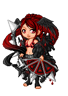
I really like it but I'm looking for some feedback on ways to improve it. anyone got any ideas?
|
|
|
|
|
Krystyne
\ (◡) /
|
|
05-17-2008, 11:49 PM
Aaaah, muy bonita! <3 The heartfox distracts me, but perhaps that's simply me. :3
|
|
|
|
|
xnarnian
Anna
|
|
05-17-2008, 11:50 PM
I think it's very pretty. (: Nice combination! Have fun with the rest of the event!
|
|
|
|
|
chibilady18
*^_^*
|
|
05-17-2008, 11:57 PM
thanks for the imput! does anyone else find the fox distracting?
|
|
|
|
|
dianakitsune
(っ◕‿◕)&...
|
|
05-18-2008, 12:13 AM
The fox does stick out, the black one might match better if you have that one. Otherwise I think it's totally cute ^^ You could even add the 2nd event item to add just a bit more :D
|
|
|
|
|
Takuto
\ (◡) /
|
|
05-18-2008, 12:36 AM
The heartfox seems out of place.
But overall, it is very nice. ^^.
|
|
|
|
|
a_shy_girl_1999
*^_^*
|
|
05-18-2008, 12:55 AM
It's very nice, I like it ^_^
|
|
|
|
|
heartpoint
ʘ‿ʘ
|
|
05-18-2008, 01:27 AM
it looks very pretty and pink.
|
|
|
|
|
fiarra
seeking proof on the roof
|
|
05-18-2008, 01:31 AM
I like how the pinks all blend together, but I agree that the fox is a little distracting.
|
|
|
|
|
lets kill elmo
Dead Account Holder
|
|
05-18-2008, 02:20 AM
Nice
but if the hair was a different color it ma look even bit better
|
|
|
|
|
Leona of the Zodiac
\ (◡) /
|
|
05-18-2008, 02:22 AM
I agree about the fox, and I think you could use a bit more red on the bottom to help balance things a bit better. But I certainly like where you are going with this!
|
|
|
|
| Currently Active Users Viewing This Thread: 1 (0 members and 1 guests) |
|
|
|