Thread Tools

Kilia
(^(エ)^)
4684.69
Kilia is offline
 
#1
Old 06-13-2012, 06:45 PM

Welcome to my pixelly artwork >wO

Okay so i just started this because i saw all the great work that everyone is doing and wanted to show Mene some love and ummmmm yes i just started this to day.

okay so please comment and give me your opinions and ummm yes

Last edited by Kilia; 06-15-2012 at 04:36 PM..

Kilia
(^(エ)^)
4684.69
Kilia is offline
 
#2
Old 06-13-2012, 06:50 PM

What i just started

Hats


base


Shirt


Last edited by Kilia; 08-02-2012 at 08:38 AM..

Kilia
(^(エ)^)
4684.69
Kilia is offline
 
#3
Old 06-13-2012, 06:50 PM

Trashed Work that can be saved

this is trash

Last edited by Kilia; 06-13-2012 at 07:36 PM..

Kilia
(^(エ)^)
4684.69
Kilia is offline
 
#4
Old 06-13-2012, 06:50 PM

Finished work

Last edited by Kilia; 06-19-2012 at 06:34 PM..

Kilia
(^(エ)^)
4684.69
Kilia is offline
 
#5
Old 06-13-2012, 06:51 PM

Helpful Sites and Advice


Pixel Art Tutorial
Derek Yu

Quote:
Originally Posted by Maria-Minamino View Post
the best thing you can do - use the darkest color for the outline ONLY. The second darkest color I usually use for ONLY the outline as well but will use very sparingly on the item if I have too. I reserve the middle 3 colors for coloring the item and the lightest color for some highlights which I also use sparingly.
Quote:
Originally Posted by Demoscout View Post
You've got the right idea, but the outline for the lighter and highlighted areas should not be lighter than the areas themselves. Just a shade or two darker.

This is a pretty poorly put together visual of the point I'm trying to make.

---------- Post added 06-15-2012 at 11:45 AM ----------

Also I zoomed in and drew around this area.


After fixing the outlines, you should take out those dark bits. It makes the outer edges look kinda static-y.

Quote:
Originally Posted by Maria-Minamino View Post
Okay

First thing - the lines should never overlap. I circled a part of the shirt near the boobs that make it look like a ladder climbing up...then I took that part and copied it and took away those extra lines so that it was truly just an outline not a climbing motion - do you see the difference? (I hope I'm making sense).

Second thing - the neckline could use some work - I yellow lined it (since redlining would have blended into the shirt)...you can bring the part by the neck UP a little bit. Then you should get rid of the extra pixels like I was talking about in point one...

Make sense?

We are fixing shape before we fix shading.

Quote:
Originally Posted by Maria-Minamino View Post
Kilia: - I still see double pixels around the neck. I circled it all in grey....

For now, I would use just the darkest shade of red, shade 6, for the outline and shade the outline later


Here is an example:


doubling it makes it look too thick

Last edited by Kilia; 02-27-2013 at 02:51 PM..

Kilia
(^(エ)^)
4684.69
Kilia is offline
 
#6
Old 06-13-2012, 06:52 PM

this post is being saved also

Kilia
(^(エ)^)
4684.69
Kilia is offline
 
#7
Old 06-13-2012, 06:53 PM

OPEN!!!

Maria-Minamino
Musician
95350.42
Maria-Minamino is offline
 
#8
Old 06-14-2012, 02:13 AM

Aw trash work? It has promise! Seriously - just keep at it :D Maybe focus on one part of it first - just do the top until it's done then do a skirt to make it a "set" :D

Kilia
(^(エ)^)
4684.69
Kilia is offline
 
#9
Old 06-14-2012, 02:52 AM

lol yea that is why it is trashed lol though i think i have lost more problems with just trying to get the coloring down pat but thank you lol *working hard*

xuvrette
(づ。❤‿...
328187.33
xuvrette is offline
 
#10
Old 06-14-2012, 06:59 AM

...Your definition of trash certainly is different than mine. XD
Your so call trash work is like just one or two more step before completion.

Kilia
(^(エ)^)
4684.69
Kilia is offline
 
#11
Old 06-14-2012, 03:43 PM

lol oh i know i meant it was trash cause well i have to go back and redo it all like the skirt i have to redo it but i think i will take Maria's advice lol and just work on the shirt first and then redo the skirt completely cause the skirt looks so thick and blegh lol

but thank you it is nice to know that my first pixel art is that close to being finished lol

Kilia
(^(エ)^)
4684.69
Kilia is offline
 
#12
Old 06-15-2012, 05:17 AM

i have NEW THINGS out!!!! lol tell me what you think

xuvrette
(づ。❤‿...
328187.33
xuvrette is offline
 
#13
Old 06-15-2012, 12:58 PM

Which one? the hat?
what you trying to do?

Alexandrus Gambino
(^._.^)ノ
12289.84
Alexandrus Gambino is offline
 
#14
Old 06-15-2012, 01:25 PM

:V Woooow.

I like the hat.

Chickie Nuggs
❀◕ ‿ ◕&...
7397.21
Chickie Nuggs is offline
 
#15
Old 06-15-2012, 02:28 PM

I like the hat too. Keep workin on it Kilia!
Usually when I think I'm done with something, someone will step up with good input that will help me actually complete the item. If there's anything that isn't necessary it's putting yourself down by calling your work trash. If you're gonna display your works, do it proudly.

As far as the hat goes, I kinda like the fuzzy texture you put in it. For now I would just say to alter the outlines of the hat depending on the light source and see how that looks.

The red shirt could definitely go without all that dithering. I can't think of very much advice to give on the shirt, though. Sorry. ^^;

Kilia
(^(エ)^)
4684.69
Kilia is offline
 
#16
Old 06-15-2012, 03:38 PM

Quote:
Originally Posted by xuvrette
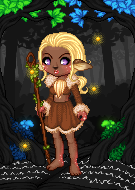
 View Post
Which one? the hat?
what you trying to do?
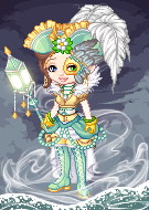
lol yes the hat trying to make it look less thick lol

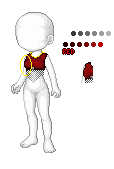
and two version of my shirt i was working on lol

Quote:
Originally Posted by Alexandrus Gambino View Post
:V Woooow.

I like the hat.
thank you >w< though i know it still needs work

Quote:
Originally Posted by Demoscout View Post
I like the hat too. Keep workin on it Kilia!
Usually when I think I'm done with something, someone will step up with good input that will help me actually complete the item. If there's anything that isn't necessary it's putting yourself down by calling your work trash. If you're gonna display your works, do it proudly.

As far as the hat goes, I kinda like the fuzzy texture you put in it. For now I would just say to alter the outlines of the hat depending on the light source and see how that looks.

The red shirt could definitely go without all that dithering. I can't think of very much advice to give on the shirt, though. Sorry. ^^;
I am trying to keep working on it though lol just a little hard when i don't know where to go from there with it lol. you really think it is fuzzy? O.O i thought that i was kind of umm.....well thick and heavy and matalic

Oh i am not putting my self down by calling my work trash lol i am calling it trash because i felt like i had to start completely over with it :yes: i display what i trash also because i know it can be saved :) and that was just trashed mainly because of the skirt and i wasn't able to separate them at the time >.>"

ah sorry about that i was just unsure about which shirt cause one has more of a checker thing going on........oh and it doesn't have the dark shading over the button

thank you for your advice will work on it :)

Chickie Nuggs
❀◕ ‿ ◕&...
7397.21
Chickie Nuggs is offline
 
#17
Old 06-15-2012, 04:27 PM

Well not just the trash part. Your opening title also says "Welcome to my crappy pixelly artwork T^T". Show more confidence girl!

Kilia
(^(エ)^)
4684.69
Kilia is offline
 
#18
Old 06-15-2012, 04:35 PM

ah yes that lol i think that is a my reflection of my mood at the time lol *huggles Demo* thank you i will change it

Chickie Nuggs
❀◕ ‿ ◕&...
7397.21
Chickie Nuggs is offline
 
#19
Old 06-15-2012, 04:57 PM

Ahh yes that's much better. uwu

Kilia
(^(エ)^)
4684.69
Kilia is offline
 
#20
Old 06-15-2012, 05:13 PM

lol yes lol i was depressed when i made this lol now for the hat........i may just redo it completely *thinks*

---------- Post added 06-15-2012 at 01:16 PM ----------

okay i fixed my shirt section @.@

---------- Post added 06-15-2012 at 01:30 PM ----------

Demoscout: i redid the hat so what do you think?


Chickie Nuggs
❀◕ ‿ ◕&...
7397.21
Chickie Nuggs is offline
 
#21
Old 06-15-2012, 06:42 PM

You've got the right idea, but the outline for the lighter and highlighted areas should not be lighter than the areas themselves. Just a shade or two darker.

This is a pretty poorly put together visual of the point I'm trying to make.

---------- Post added 06-15-2012 at 11:45 AM ----------

Also I zoomed in and drew around this area.


After fixing the outlines, you should take out those dark bits. It makes the outer edges look kinda static-y.

Kilia
(^(エ)^)
4684.69
Kilia is offline
 
#22
Old 06-15-2012, 06:46 PM

*listens and nods head* i see what you are saying lol that part always escaped me in art class *goes to do it again*[COLOR="lightseagreen"]

---------- Post added 06-15-2012 at 02:09 PM ----------


how about this one Demoscout: ?

Last edited by Kilia; 06-15-2012 at 07:13 PM..

Chickie Nuggs
❀◕ ‿ ◕&...
7397.21
Chickie Nuggs is offline
 
#23
Old 06-15-2012, 08:13 PM

I zoomed in and yes the outlines look much better. Beneath those outlines are noticeable grey specs that stand out too much. That is what I said made the edges look a bit static-y. You should remove them and replace them with one of the lighter colors in that area.

xuvrette
(づ。❤‿...
328187.33
xuvrette is offline
 
#24
Old 06-15-2012, 10:26 PM

I see that Demomo is helping~ ^_^
*venture off to see others*

Maria-Minamino
Musician
95350.42
Maria-Minamino is offline
 
#25
Old 06-15-2012, 10:27 PM

Oh! I like the silver addition to the shirt!


Currently Active Users Viewing This Thread: 1 (0 members and 1 guests)
 
Thread Tools

 
Forum Jump

no new posts