|
royal randomness
ʘ‿ʘ

|
|

02-03-2011, 05:50 PM
i like how the black on your avi is incorporated into the pinks ad red and i think they are set perfectly i think you need a tad it in the back round to balance it a little more thouh i give you a 8/10
|
|
|
|
|
chronic_heartbreak14
\ (◡) /
|
|
02-04-2011, 12:15 AM
magnificent! i love that white ribbon you added, it gives you that white you needed 10/10 because the layering, balance, and color coordination is superb
|
|
|
|
|
Angel Song
*^_^*
|
|
02-04-2011, 09:04 AM
mmmmm 6/10
I like how it's not SO overlayered, and the hair is totally cute, but it's not really interesting, and the red doesn't go well with the purple
maybe try replacing the purple with green, it would look nice with the yellow as well
or maybe replace the red with blue for a more 'cool' effect
|
|
|
|
|
White Squirrel Girl
The Spazatic little cookie
|
|
02-04-2011, 01:50 PM
7 out of 10
It's simple and well though through. The colors mix well, there isn't to much of one thing and not enough of another thing. Though a white belt would help.
|
|
|
|
|
Taliesin
⊙ω⊙
|
|
02-04-2011, 02:07 PM
6/10
Seems a little bare but I do love what you've done so far :D I suggest maybe making the hair a lighter shade of silver and adding some more accessories around the neck and wrists to make the colours stand out more. I think a skirt would look better than short too.
|
|
|
|
|
Black Phoebe
\ (◡) /
|
|
02-04-2011, 11:10 PM
9/10
I love the concept, I like how it's not obsessively 'matchy matchy' or layered to overkill and it's just all together cool.
|
|
|
|
|
royal randomness
ʘ‿ʘ
|
|
02-04-2011, 11:29 PM
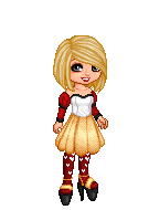
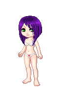
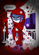
i lke how the red pops and how se looks like se was either a run away or lost in the woods i give you a 9/10
|
|
|
|
|
Roka
(っ◕‿◕)&...
|
|
02-04-2011, 11:33 PM
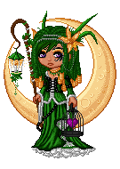
I still think that you should get rid of the wand, wings, and the hot chocolate, and add gold to the top of your avi. I think that the white space in the middle of your legs should be layered different colors as well, because it's layered in the middle.
6 / 10
|
|
|
|
|
bloodstainedwings
"avagasm"
☆☆☆☆☆
Moderator
|
|
02-04-2011, 11:40 PM
i love it. its well layered and its elegant. i love how you layered your arms with the wrap and the arm guard. thats cool. i think that you might need a tad more black on your feet since there is so much by your head... like maybe the spiked heals if they layer with those shoes or the raven ankle wings if they dont. other then that its brilliant.
9/10
|
|
|
|
|
chronic_heartbreak14
\ (◡) /
|
|
02-04-2011, 11:56 PM
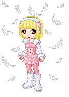
i love how the teals match the bachground and all the butters/toffee color all match too. its so cute and the BLOOMERS WORK *walrus face*... yeah walrus face... the white is such a pretty accent color too, and it all works really well. i like that its a starry nice in a winter wonderland type thing :yes:
10/10
|
|
|
|
|
Linnea
☠ ☠ ☠
☆☆☆☆☆☆☆
Moderator
|
|
02-05-2011, 08:05 AM
i enjoy looking at your color scheme... it's very pleasing to the eye... i like how you layered the feet and the head items... maybe add the gold boxers if they peek out from under the shorts... you need a touch more gold between your waist and your ankles... also your hair is just a touch too blue to match the purples on the rest of your avi... i'd recommend just moving your little cursor towards the red a little bit to balance it out and it'll match perfectly!
8/10
|
|
|
|
|
Black Phoebe
\ (◡) /
|
|
02-05-2011, 08:10 AM
8/10
though I think some black bottoms would look better (she kinda looks like she's been pants'd) I do adore the colour scheme, and the layering works very well.
|
|
|
|
|
Murasaki Fujiwara
Potato
|
|
02-05-2011, 12:02 PM
7.5/10 I like the progress I'm seeing, but it still needs a few more details!
|
|
|
|
|
Taliesin
⊙ω⊙
|
|
02-05-2011, 05:43 PM
7/10
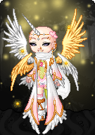
I love the theme. It looks so innocent and angelic, but I don't think the background image matches this theme, especially with the grass. If you had something that made your avi look a little more morbid, or a background that looked more elegant, I think it'd really bring out the beauty of your avi :D
|
|
|
|
|
Kiako
We are heroes; heroes of the nig...
|
|
02-05-2011, 07:04 PM
Oh you have shoes now! And the purple hair is definitely awesome (purple is in fact my favourite colour).
I still don't have too much I can really say about your avatar, however. Pretty much the same thing I said last time. Awesome theme, good items. Erm, maybe add the Pyro Marks from the Tattoo Shop.
That's all I can say really. 7 / 10
|
|
|
|
|
royal randomness
ʘ‿ʘ
|
|
02-06-2011, 12:59 AM
i love how the lavender pops amungst the white and black it is layered perfectly and i give you a 10/10
|
|
|
|
|
Hresvelgr
It's 11PM, do you know where you...
|
|
02-06-2011, 03:40 AM
I always love a good brown Avi. I rarely see them on this site xD The only thing bothering me is the block of white on your legs. It fits in, but just sticks out so much. My eyes are drawn right to them instead of the Avi itself. 7/10, I would add some sort of fish nets, or even layer socks. Just something to break it up >.<
|
|
|
|
|
chronic_heartbreak14
\ (◡) /
|
|
02-06-2011, 06:14 AM
oooh its so cute :D i think if you changed the hair to a solid red it would work more, but it looks good as is. the neck layering is so cute :D and the whips and all the hearts make me think of a warrior of love. 10/10
|
|
|
|
|
CrimsonShadow
Glitter addict...beware
☆☆
Penpal
|
|
02-06-2011, 07:48 AM
9/10
I like the colors together very much and the simple layering! Your hair needs to be a tid more lighter and I wish you could get some more gold on your chest and legs. But over all I really like it! Nice job!
|
|
|
|
|
Black Phoebe
\ (◡) /
|
|
02-06-2011, 07:56 AM
9/10
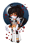
the scarf isn't quite the same white as the skull or horns, but I don't think there is an item like that with the right white anyway so I'll ignore it
the background does make it seem a bit too dark though, maybe try using the blue background instead?
but I love the crystals and though I usually hate teal, it looks good with the black and white
|
|
|
|
|
Angel Song
*^_^*
|
|
02-06-2011, 08:41 AM
8/10 I like the mushrooms and fireflies but I'm not big on the blood, clean it up a bit
|
|
|
|
|
royal randomness
ʘ‿ʘ
|
|
02-06-2011, 02:27 PM
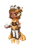
the pink and yellow blend well and the yellow pops out alot i think you need more white i give you a 7/10
|
|
|
|
|
Roka
(っ◕‿◕)&...
|
|
02-06-2011, 05:45 PM
I'm still standing by my original opinion that you take out the wings, wand, and the hot chocolate and get some layering on your feet to balance out the middle.
Maybe some dashes of white around the waistline of your avatar would do nicely to break up the brown and gold layering there. I think that you should get some white around your neck and possibly something golden on your arms.
I still stand at a 5 / 10.
|
|
|
|
|
Linnea
☠ ☠ ☠
☆☆☆☆☆☆☆
Moderator
|
|
02-06-2011, 06:18 PM
really interesting color scheme and the layers are pretty good... i like the choice of hairstyle, just the color seems a little too much on the pink side... there really isn't a 'wow factor', something to make it eye catching, maybe some sort of ci or ei...? but i think it's a good step in the right direction 7/10
|
|
|
|
|
woohoohelloppl
Lurking
☆☆☆☆
|
|
02-06-2011, 06:31 PM
9 // 10
I just love the colors and layers you've got. It's balanced really nicely as well. Are the fish really necessary though? They sort of seem random and make the top heavier than the bottom.
|
|
|
|
| Currently Active Users Viewing This Thread: 9 (0 members and 9 guests) |
|
|
|