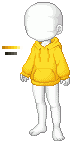
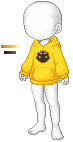
Heeeey! I'm likin the sweater you came up with! You are definitely better at pixeling than how you give yourself credit.
The ONLY thing I could think to suggest is adding one or two more shades to the mix. You outlined and shaded very well, but I noticed that you have a light shade and a very dark shade with nothing in between. I think if you included an shade that sits between the lighter and the darker, then it will be flawless!
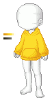
Thanks Dems. I think I'll probably leave the emblem off though since it's so resembling to the Welcome tees.
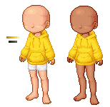
I did use 4 shades, I guess I could pull the darker shade out more, it just looked harsh when I did that. I haven't used the fifth highlight shade yet because I'm a little unsure of how to properly use it.
Oooh I get what you mean now. For some reason I thought you meant leave it alone. I'd say keep it on because who knows it may just become an actual item to sell and one day become something rare. ;P
But if it's just gonna be put in the Newbie shop, it won't be very hard to get. :lol:
Maybe I'll try to make a ham symbol, like a subtle signature and also a play off Fresh Meat, haha.
If you are still looking for pixel tips - I ahve a post in my thread (4th or 5th one down on the front page) with some of the stuff I've learned so far about pixelling :D
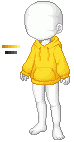
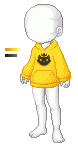
I actually really enjoy the shape of your hoodie!!! And while I liked the cat emblem, I really like it just plain - I could see it being recolored in many different colors for newbies to choose from! It'sa very versatile item.
I haven't opened it in paint yet so I can't really get a good look at it - but I feel like it could use some folds and wrinkles placed in different places - just to give it a more realistic look - the hoodie looks big and comfy and something that would have a bunch of wrinkles and stuff - but that could just be my opinion - I don't know what fabric you are envisioning it as XD
But overall I really really really love it so far :D
Thanks Mina, I actually went through your thread first before starting. Where would you suggest putting wrinkles?
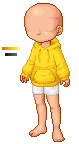
I made the hood a little less lumpy and claylike hahah. Fixed the pocket a little.
I hope my thread helped some - I try to post any pointers people have given me but I'm afraid I've forgotten some XD
I like to look at real life photos of clothing similar to what I'm making... and I feel like this picture shows a hoodie with wrinkles pretty well :D If it helps at all.... XD
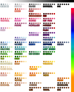
Also - i feel like I've been saving this for myself and I really should have uploaded it sooner - but Xuvrette made this really awesome palette chart for us to use:
Last edited by Maria-Minamino; 04-12-2012 at 04:16 AM..
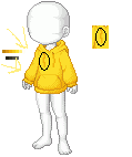
I love the addition of the strings! I didn't even think of those XD
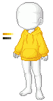
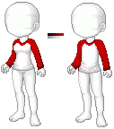
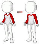
Right now on the avvies left you have the shading going slanted toward the middle down....I think adding just one more on the opposite side of the hoodie down at the bottom would look good...you have it on the avvies left right now like this "/" and if you added a slightly smaller one goign this way "\" instead it would give it some depth I feel.
I was originally just saving items and using the dropper but I feel like this saves so much time using the chart XD
EDIT:
OMG I'm really horrible at explaining in words...but something like this:
Last edited by Maria-Minamino; 04-12-2012 at 04:30 AM..
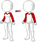
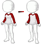
Heheh I understood what you meant, thanks! I added a little more shading on the avi's right, and fixed the pallet since my next to darkest color was off once I compared it to that chart. This is my last fix for tonight, getting a little tired of looking at this sweater. >:c
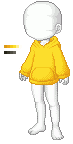
Added the darkest shade, I still can't find a way to make the lightest color work though. I'm gonna set this one aside as tentatively final, unless anyone else has any further suggestions?
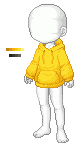
I like what you have with the added wrinkle on the other side. Although the shading of the strings......I feel like the avvies right string...the shading needs to be on the other side of the string. Since the light source is coming from the avvies right....it doesn't make sense the shading is to the left of the string....does that make sense? EDIT - I just noticed the shading of the strings are BOTH to the left of the string rather than the right...
As for the lightest shade - it's really only used as a highlight. In the case of your hoodie which I imagine is just a plain cotton hoodie...there really wouldn't be super high lights on it like there would be on satin or a shinier fabric. So you could be good just leaving it off if you want to. :)
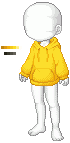
Also - you could add a little more highlight to the outline on the avvies right if you wanted to. The outline is mostly shades 5 and 6...but you could use shade 4 if you wanted just where the light would hit it the most.
I'm really horrible at explaining in words so I've drawn it for you:
It's a really subtle detail and I'm being picky so I apologize....
I've circled what I've talked about - then copied it and put the shading on the other side.
EDIT - the outline looks good :D
and yeah - I tried adding some of the shade 1 to it and you are right - it looks more plastic XD I say leave it without it :D I think that's why they give you the possibility of 5 OR 6 shades...because sometimes you dont' need the extra color
Oh, so the string shading looked better on the previous version? I wasn't too sure, it's kinda hard for me to tell when the thing is just two pixels wide haha. I'll switch it back then, thanks for your help :D
Oh, so the string shading looked better on the previous version? I wasn't too sure, it's kinda hard for me to tell when the thing is just two pixels wide haha. I'll switch it back then, thanks for your help :D
Only because it made more sense from where the light was coming from XD The other string in the previous version is the same as in this one? I feel like it should be on the opposite side as well just because the light hitting it would make it go that way.... XD