|
Naisou
Can't rain all the time
☆☆☆☆

|
|

12-14-2008, 01:06 AM
Well, I've been working on this for far too long, and decided to try and finish it today. I think all I'm going to do to it now is fix up the stem and clean up the edges. Anyone have any other suggestions/comments?
http://i210.photobucket.com/albums/b..._cleancopy.jpg (old)
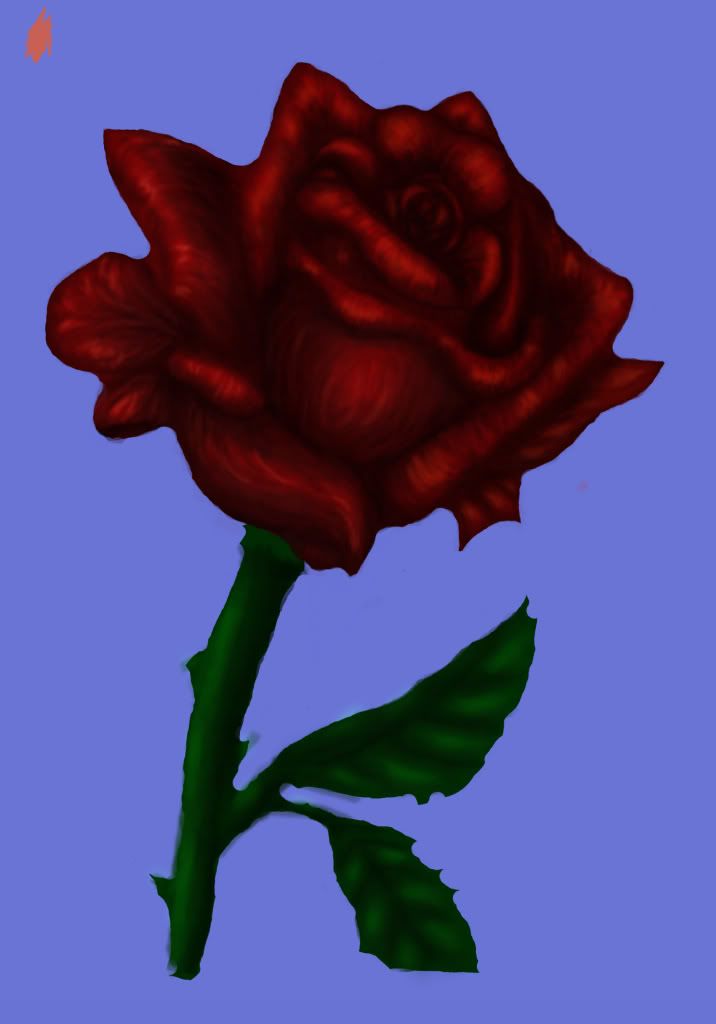
(edit-ness) Less liney now, also less shiny... :cry: oh well, life hates me. *scurries off to do her real art project*
sorry its so big.... :? and i think i changed styles halfway through...oh well that's what I get for starting this in Feb, forgetting about it and not 'finishing' it until today...:sweat:
Comments/Critic-like stuff?
Last edited by Naisou; 12-15-2008 at 12:13 AM..
|
|
|
|
|
Jesweet
*^_^*
|
|
12-14-2008, 02:38 AM
It looks good so far
I would suggest you use higher contrast as now the whole thing is blending into itself.
|
|
|
|
|
Sho-Shonojo
(っ◕‿◕)&...
|
|
12-14-2008, 04:29 PM
I think, the flower petals definitely need to be blended more in some way. All of the lines you have in the petals, give them a texture they don't really have. They need to be smoothed out somehow.
|
|
|
|
|
MurasakiCrown
\(@O@)ʌ...
|
|
12-15-2008, 04:55 AM
I think it looks quite good so far. I would suggest the following things, however:
1. Make some of the lines identifying each rose petal a little bit more defined. For the most part, this isn't a problem, but at some points, the petals start to blend into each other. I also suggest you smooth out the texture. Right now the rose looks almost furry, while it needs to look smooth. Use the blur tool, or even paint over it again with a soft brush?
Some more contrast in the stem would help. Right now it doesn't look up to the same standard as the rose. Crisper edges would help it. and maybe instead of a solid blue background, a gradient starting at the top, from a slightly dark blue, to a lighter blue?
Overall, very nice. It's really coming along. I've always thought drawing roses was a real pain D8;
|
|
|
|
|
MoodyBats
Scarce Menewshan
☆☆
|
|
12-16-2008, 08:18 AM
wow!amazing!it really looks like a
rose.keep up the good work
|
|
|
|
|
Jack MacGaven
Vampire of Menewsha
|
|
12-17-2008, 02:40 PM
Looks good so far. Though I think you should smooth the thing out a bit, but that's more personal taste.
|
|
|
|
|
blackbunny
⊙ω⊙
|
|
12-18-2008, 01:23 AM
omg i love that rose, just that one!
|
|
|
|
|
Naisou
Can't rain all the time
☆☆☆☆
|
|
12-20-2008, 01:34 AM
Quote:
Originally Posted by Jesweet

It looks good so far
I would suggest you use higher contrast as now the whole thing is blending into itself.
|
Jesweet: Yeah, I did notice that, and I'm going to fix it, eventually. I procrastinate too much. lol
Quote:
Originally Posted by Sho-Shonojo
I think, the flower petals definitely need to be blended more in some way. All of the lines you have in the petals, give them a texture they don't really have. They need to be smoothed out somehow.
|
Sho-Shonojo: Now that you mention it, yes, it is rather....liney...:oops: went back and smoothed it out some, hopefully its a bit better. Personally though I like it. XD
Quote:
Originally Posted by PlatinumChild
I think it looks quite good so far. I would suggest the following things, however:
.....this got really long...:sweat:
1. Make some of the lines identifying each rose petal a little bit more defined. For the most part, this isn't a problem, but at some points, the petals start to blend into each other. I also suggest you smooth out the texture. Right now the rose looks almost furry, while it needs to look smooth. Use the blur tool, or even paint over it again with a soft brush?
Some more contrast in the stem would help. Right now it doesn't look up to the same standard as the rose. Crisper edges would help it. and maybe instead of a solid blue background, a gradient starting at the top, from a slightly dark blue, to a lighter blue?
Overall, very nice. It's really coming along. I've always thought drawing roses was a real pain D8;
|
PlatinumChild: wow, lots of advice. XD Thanks, once again definition was mentioned...lol really need to work on that, I'll try to as soon as I get all of my schoolwork done. Hmmm...texture, wonder if you are talking about the first or second one....but I don't think that either look furry...maybe fuzzy....I kinda like it though so I proabably won't change that too much, sorry. Thanks for your imput though.
As for the contrast in the stem and the background, I really hadn't worked on those too much, I was more interested in the petals themselves, thanks though, I'll take it into consideration when I do work on them.
And yes your right, drawing roses is a pain, too many different parts and folds, :insane: (mind explodes)
Quote:
Originally Posted by TheDesireMistress
wow!amazing!it really looks like a
rose.keep up the good work
|
TheDesireMistress: Thanks alot, glad you like it.
Quote:
Originally Posted by Jack Macgaven
Looks good so far. Though I think you should smooth the thing out a bit, but that's more personal taste.
|
Jack Macgaven: Thanks, I see what you mean...but I kinda like it that way...decisions decisions...lol
Quote:
Originally Posted by blackbunny
omg i love that rose, just that one!
|
blackbunny: Glad you like it blackbunny, *wonders what you mean by "just that one!"....*
|
|
|
|
|
MurasakiCrown
\(@O@)ʌ...
|
|
12-20-2008, 03:57 AM
Oh my gosh! *pieces your mind back together* Please don't explode ;_;
Haha, I've only drawn them a few times myself, and I've never actually colored one. Well, I DID, but it was a flat color, and it had lineart, so the petals were easier to define XD; *fails*
|
|
|
|
|
Naisou
Can't rain all the time
☆☆☆☆
|
|
12-23-2008, 06:55 PM
Quote:
Originally Posted by PlatinumChild
Oh my gosh! *pieces your mind back together* Please don't explode ;_;
Haha, I've only drawn them a few times myself, and I've never actually colored one. Well, I DID, but it was a flat color, and it had lineart, so the petals were easier to define XD; *fails*
|
I can't explode.... :(
Well, at least you finished, I don't know if I ever will. I have too many other things that I should be doing, and its taken me almost a year to get this far....although I didn't work on it for most of it.
But my finger hurts....its hard. *point click drag* *point click drag* :headdesk:.....I wish I had a tablet, but somehow I think I'd fail with it, so I'll stick to my trusty mouse, and keep lots of ice on hand.....lol
Last edited by Naisou; 12-24-2008 at 04:11 AM..
|
|
|
|
|
Midian
(っ◕‿◕)&...
☆☆☆☆
|
|
12-25-2008, 04:10 PM
Wow, so beautifull!
|
|
|
|
|
Liath
\ (◡) /
|
|
12-25-2008, 05:58 PM
wow, i love the shading!
|
|
|
|
|
Koari
(-.-)zzZ
|
|
01-01-2009, 06:13 AM
It's pretty! I'm jealous ....:headdesk:
Beautiful art! :heart:
|
|
|
|
| Currently Active Users Viewing This Thread: 1 (0 members and 1 guests) |
|
|
|