So I thought I'd post some art here... even though I constantly beat myself up for all its flaws already... But oh well. XD Nothing gained if nothing ventured! So here's a couple!
------------------------------------------------------------
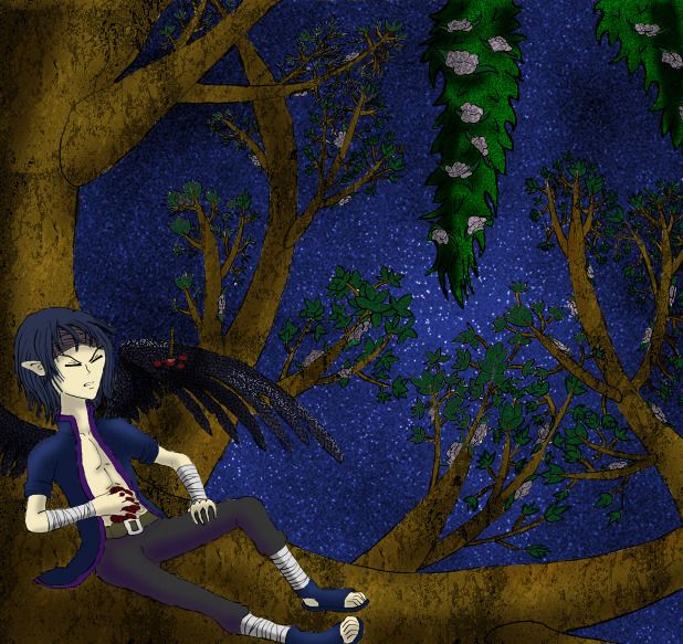
Yeah, the wing proportions are waaay off base... And the shading's not so great throughout the picture. I was experimenting in manga studio- using tones and such to create textures before coloring it.... It's not so bad for a first attempt...
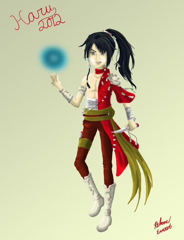
This was my first time ever trying the 'semi realistic' coloring style... Originally, it was a scribble in my sketchbook where I was designing some clothes for a character, but I decided to experiment coloring it- hence why the pose is stiff... I never bothered to fix it... But the coloring could have been done much much better...
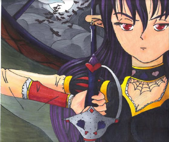
The scanner ate the colors... Really bad... It does not look that scribbly in actuality... Could have done better on the shading though... This was done with copics markers, white paint, and sparkly gel pens.

This one I did in photoshop and sai.... I could have done better with this one too, but it's a couple I really like, so I guess it's alright....
-----------------------------------------------------------
...So let me know what you think! And if you have time, check out
my thread asking for a price range! I haven't been able to get any replies and it'd be nice to have some input.
---------- Post added 06-30-2012 at 10:51 PM ----------
....Anyone out there?
Seriously? O-o -voice echoes-