|
demonic pudding
Dead Account Holder

|
|

08-05-2007, 12:02 AM
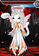
Yea, this are my newest CG's for my website.
Does any one have suggestions on how i can improve my skills?


|
|
|
|
|
Mr Twit
ʘ‿ʘ
Banned
|
|
08-05-2007, 12:39 AM
Not really i think they look awesome and what is your websight?
|
|
|
|
|
Caeluma
(っ◕‿◕)&...
|
|
08-05-2007, 01:39 AM
ah those are too cute ^_^
|
|
|
|
|
Visual Zombie
|
|
08-05-2007, 03:17 AM
I think the likkle bear could use some more contrast to bring out his details, but other than that they look really cute! :3
|
|
|
|
|
demonic pudding
Dead Account Holder
|
|
08-05-2007, 03:33 AM
Quote:
|
Originally Posted by Mr Twit
Not really i think they look awesome and what is your websight?
|
Thanks o3o
www.mathura.pockybox.org
@Caeluma: Thanks :D
@Visual Zombie: contrast.. as in shading?
|
|
|
|
|
Visual Zombie
|
|
08-05-2007, 03:46 AM
Not really shading. Basically, contrast is putting two different colors (black and white, for example) next to each other for emphasis. So on the bear, I'd use a lighter color on the stitches so they're more visible. Maybe a lighter brown so it still matches.
Hope that helps. ^-^;
Edit: omg, your site is adorable! X3
|
|
|
|
|
IshokuOsero
\ (◡) /
|
|
08-05-2007, 08:25 AM
Wow, lovely art~ I agree with Visual Zombie though, about the contrast. It's hard to see the eyes and stitching with the way you have your colours set up, so either have a lighter fur or lighter eyes and stitches. It could work with darker eyes and stitches also, though.
|
|
|
|
|
Rhythm
hiatus
|
|
08-05-2007, 08:53 AM
Oh wow.
So cutee~ <33
I really don't have any tips though. o;
|
|
|
|
|
demonic pudding
Dead Account Holder
|
|
08-05-2007, 02:01 PM
Quote:
|
Originally Posted by Visual Zombie
Not really shading. Basically, contrast is putting two different colors (black and white, for example) next to each other for emphasis. So on the bear, I'd use a lighter color on the stitches so they're more visible. Maybe a lighter brown so it still matches.
Hope that helps. ^-^;
Edit: omg, your site is adorable! X3
|
okay i get you ^^ thanks
@IshokuOsero: okay : D
@lil_miss_ninja: Thanks
|
|
|
|
|
~LONGCAT~
is Long
☆☆☆☆
Moderator
|
|
08-06-2007, 12:15 AM
BEAR!!!! I love bears you don't realize how happy this makes me, it is adorable and has such character. you're style is wonderfully whimsical.
<3
|
|
|
|
|
suppi
sleepyhead
|
|
08-06-2007, 01:39 AM
Awww~ how cute. ^^ <3 I have no suggestions for these 'cause they look great. xD
|
|
|
|
|
cis
Dead Account Holder
|
|
08-07-2007, 03:58 PM
Awwwww. So cute! They are amazing! I like the bear more, and I think this is because the bear is simpler in shading? And the bear is a king bear. And maybe because I just like bears more than whales.
Umm.. But I think the bear might be missing some furry part in the buttom center, behind his back.
|
|
|
|
| Currently Active Users Viewing This Thread: 1 (0 members and 1 guests) |
|
|
|