|
Jiriyanu
Hello, chu.

|
|

06-29-2009, 04:31 AM
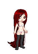
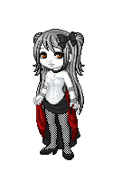
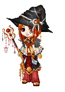
No. This isn't traced. This is original. Done by me at school when I was soo bored.
Please judge them by a scale of 1-5. So, here are some links to my pictures.
Well, you'll know her name.
http://i525.photobucket.com/albums/c...222/yame-1.jpg
I know, her body is sorta distorted from a normal body I usually make. Her bust is kinda big[a little]
her waist is too small. But, THE FACE IS GREAT! But not really perfect. Oh, wait a minute! I'm judging my own drawing.
I think I'm giving it a 2, though.
|
|
|
|
|
iSteve
Art connoisseur
|
|
06-29-2009, 05:15 PM
don't draw on lined paper.
it's good, but the left eye is smaller than the right, the arms are a little awkward, and the body looks like she has no bust at all, just a barrel chest.
|
|
|
|
|
Esteji
*^_^*
|
|
06-29-2009, 09:00 PM
neck is too long
arms too thin
waist too thin
looks like she has no rib cage
lips should be bigger
|
|
|
|
|
Jiriyanu
Hello, chu.
|
|
06-30-2009, 03:50 AM
Haha, I drew it in school though. So that's why it was on lined paper.
And why should the lips be bigger?
|
|
|
|
|
iSteve
Art connoisseur
|
|
07-01-2009, 04:39 PM
Doesn't matter where you draw it, don't draw on lined paper.
Find computer paper, or drawing paper.
Not lined paper.
also: Study anatomy, a lot.
|
|
|
|
|
Tsukiyoku
(-.-)zzZ
|
|
07-02-2009, 03:36 AM
3/5.
I don't really mind that it's on lined paper, as long it is not a commission.
where do you think you can get a computer paper at school?
The waist is too small, and the hand, too.
|
|
|
|
|
Mesmerized
⊙ω⊙
|
|
07-03-2009, 03:06 AM
Hm, anatomy-wise it's not correct, there are some flaws. But then again, it's anime-styled, and there are some proportions which aren't really correct when comparing to RL. I think her face looks good; I don't think you should make the mouth bigger if you don't want to- it's a matter of personal taste and style.
However, as you go down her body seems to get thinner and thinner. Her hips should be shoulder lenght, and the waist I think is too thin. Her boobs too look way too big- try shrinking them.
Soooo hope that helps :)
|
|
|
|
|
Evermore_112
Loving The Peaceful Crash of Hea...
|
|
07-03-2009, 07:35 AM
2
Good:
-definite lines
-wonderful eyes, looks like tears
-eyes match sorrowed face
Bad:
-lined paper (not counting off, just saying)
-Chest HUGER than waist
-No 3D shadowing or effects
-Black and white, no definition or value
|
|
|
|
|
zammap
Art pirate
|
|
07-03-2009, 06:36 PM
leaving lined paper in the sun will bleach the lines away
|
|
|
|
|
Kieran Haines
*^_^*
|
|
07-06-2009, 03:08 AM
Mm, I'd say...2.5?
The people above me have already said most of the things I wanted to say. . w.
Like how it doesn't really look like she has a rib cage, how her arms need more meat in them, and her boobs look big and odd - just some anatomical issues.
Even thought it's in an anime/manga style, you should still pay attention to figures in real life, and how they look. Like most mangaka's still keep in mind basic anatomy structures and guidelines in their art.
Buttt
I really do like the face. I love~ the way you shaded in the eyes. :3 It looks quite pretty.
|
|
|
|
|
Mystic
(ο・㉨・&...
☆
|
|
07-06-2009, 03:41 PM
I like her hair. Her chin is a bit too pointed. Her arms are too thin and her waist shouldn't curve like that. Try defining her hips a bit more. That should help even it out.
|
|
|
|
|
chibifox1027
|
|
07-30-2009, 11:12 PM
its okay but not the best. work on the eyelashes.. there are wayyyy too many.
Your proportions also need to be fixed. For example the waist is too thin and so are the arms. The neck is also too long.
The hair can use some shine and the stands on the bottom and shoulder should be fixed up.
oh and the chin is a bit too pointed.
Hope this helped ^_^
|
|
|
|
|
BlackMage KaiheiTsukiredi
Kaihei Tsukiredi the Black Mage
|
|
07-31-2009, 08:16 PM
Hmmm... I don't mind the lined paper, I could care less if it was on lined paper or not.
I'll give you a 3/5.
What I like about this picture: I like how you did her hair, it looks smooth and soft. I also like how you did her eyes, they look pretty and unique. You match the the expression perfectly, a very good sorrowed facial expression. And the lines are smooth, another plus.
What needs to improve: The anatomy is pretty bad. Her arms are way too thin and so is the waist. What I might suggest is studying a little on female anatomy. Her chin needs some work; you should keep the tip of the chin pointed (but unless you really like it as it is, you should smooth out the jaw line so that the chin doesn't look like a " { "). Now either her eyes are way to big for the face or the nose and mouth needs to be larger. Put some detail in the ear that is exposed (and you should had shown some evidence that the other ear is covered, otherwise it looks like she doesn't have another ear at all). Now I suggest you should put some wrinkles in the shirt to make it pop out more. Also, the hair need some light source so it doesn't look like one big blob of "black stuff". You should also try using shadows too (and also, try to shade in a small, circular motion to avoid havign white lines).
Hope this helps at all.
|
|
|
|
| Currently Active Users Viewing This Thread: 1 (0 members and 1 guests) |
|
|
|