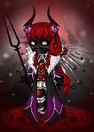
haha numbers really help me!
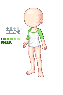
Lightest is 1 and darkest is 6!
Alrighty - I've just zoomed in and was messing around with the coloring on the sleeve myself. (although I wont' show you because I want you to get it yourself! lol)
The thing with shade 6 (darkest shade of the palette) is that it should be subtle and spare. I, personally, added it just to the farthest side of the sleeve from the light source. That's really all you need with it.
In addition on the sleeve you have shade 2 (second lightest shade) with some shade 3 shading (3 lightest shade) and just a touch of shade four near the crease. Add a BIT more of shade three then add shade four between the shade three at the outline. Does that make any sense?
Like this:
In addition - the lightest shade, shade 1 can be incredibly subtle as well - just like shade 6 is. A little bit goes a LOOONG way. If there is a part where there is a lot of the base shade (shade 2) just add a touch of shade 1 in there.
It's not the palette that's acting wonky, I promise! (Actually the other pink palettes are harder to use!). You just need to add a touch more detail and it will look great :) Pixels are SO small it's all in the details!